Haiku Visual Narrative
Spring 2023
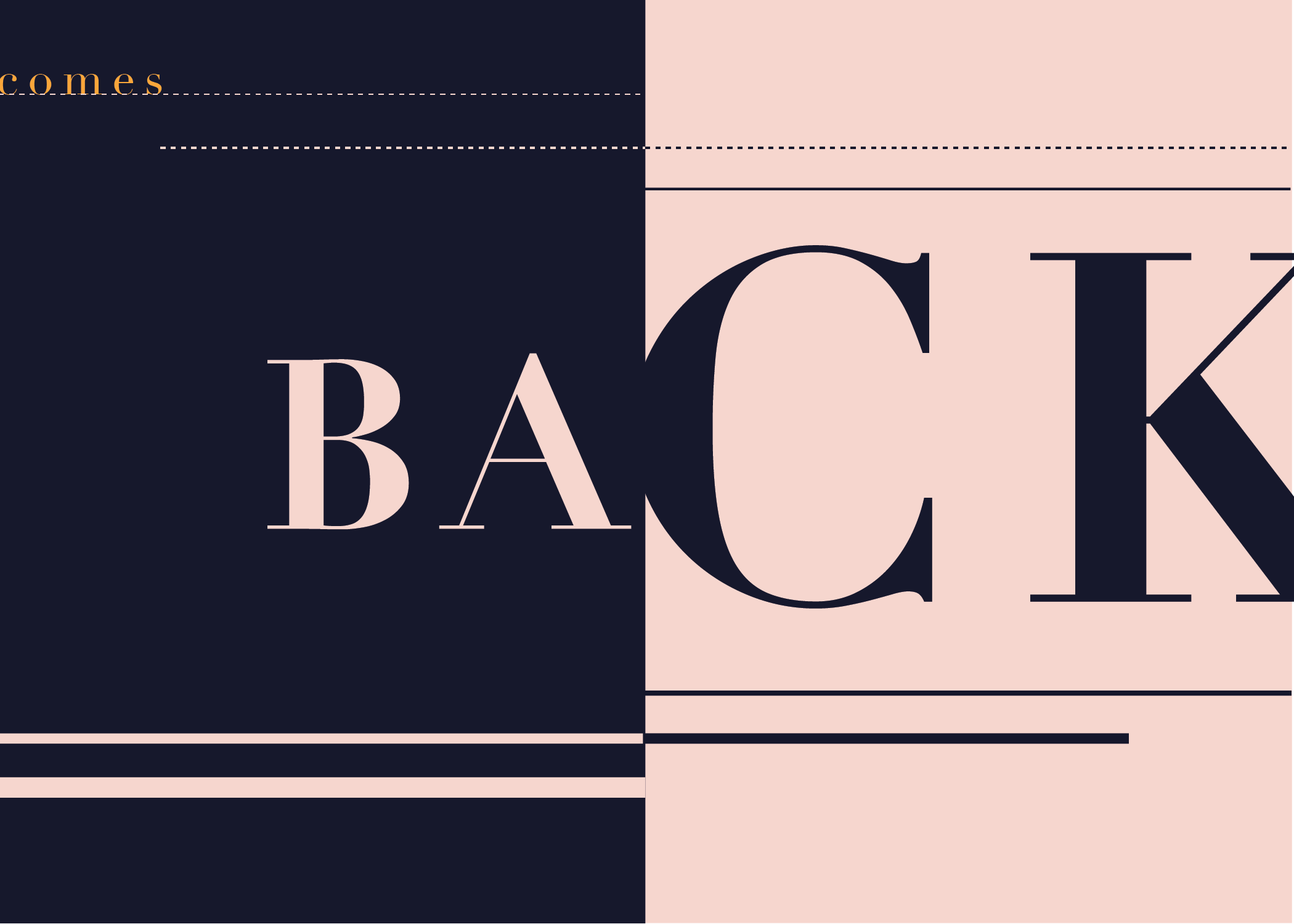
The objective of this project was to design a sequential visual narrative of a haiku in the form of an 8-page booklet. I used proportion to create visual harmony and unity across the spreads in addition to non-literal elements and symbols to represent the meaning of the haiku. Each page spread represents one line of the poem.
The haiku I chose to design was "[goes out comes back]" by Kobayashi Issa.
"Goes out,
comes back—
the love life of a cat."
Research & Brainstorming
I interpreted this haiku as Issa highlighting the typical duality of a domestic cat - how from one moment they can be aloof and withdrawn and the next playful and attention-seeking to its owner. This theme was personal to me because I have pet cats that have been a big part of my life.
To communicate this message, I aimed to use visual contrast and paradoxical elements to portray the "back and forth" attitude cats can have towards their loved ones.


I utilized the letter "o" from the first line of the poem ("goes out") as a reoccurring representation for the eyes of the cat in addition to using typographic semiotics to visually express the meaning behind the haiku.
I used a variation of a split complementary color palette (blue, red-orange, orange-yellow) in order to create high contrast with the dark blue and light red-orange and a focal point for the orange-yellow eyes of the cat.
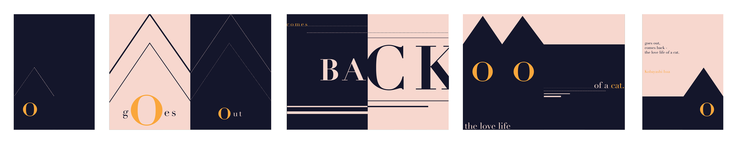
Although separated, I treated the front and back covers as its own spread and used symmetry to represent the two "sides" of the cat. I chose to do this as a preview or final representation of the theme of the haiku - the "back and forth" behavior of a cat.

Final Narrative