Spring 2023
iPhone 14 mockups by ls.graphics
The objective of this project was to create a Flight Information System mobile app for the Chicago O'Hare International Airport. The goal was to create an easily understandable and readable system for anyone that may use this application.
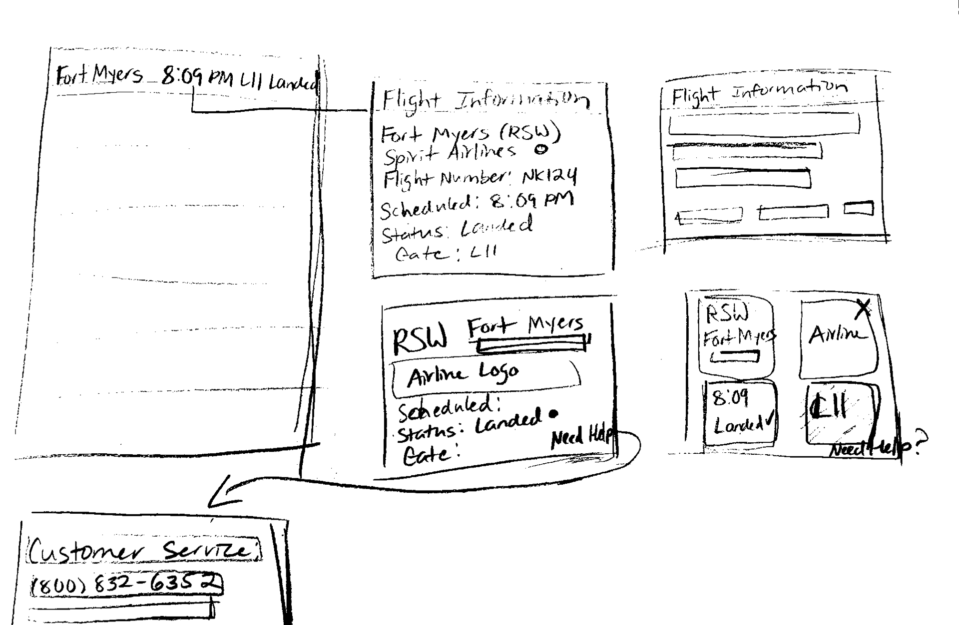
Brainstorming & Early Concepts
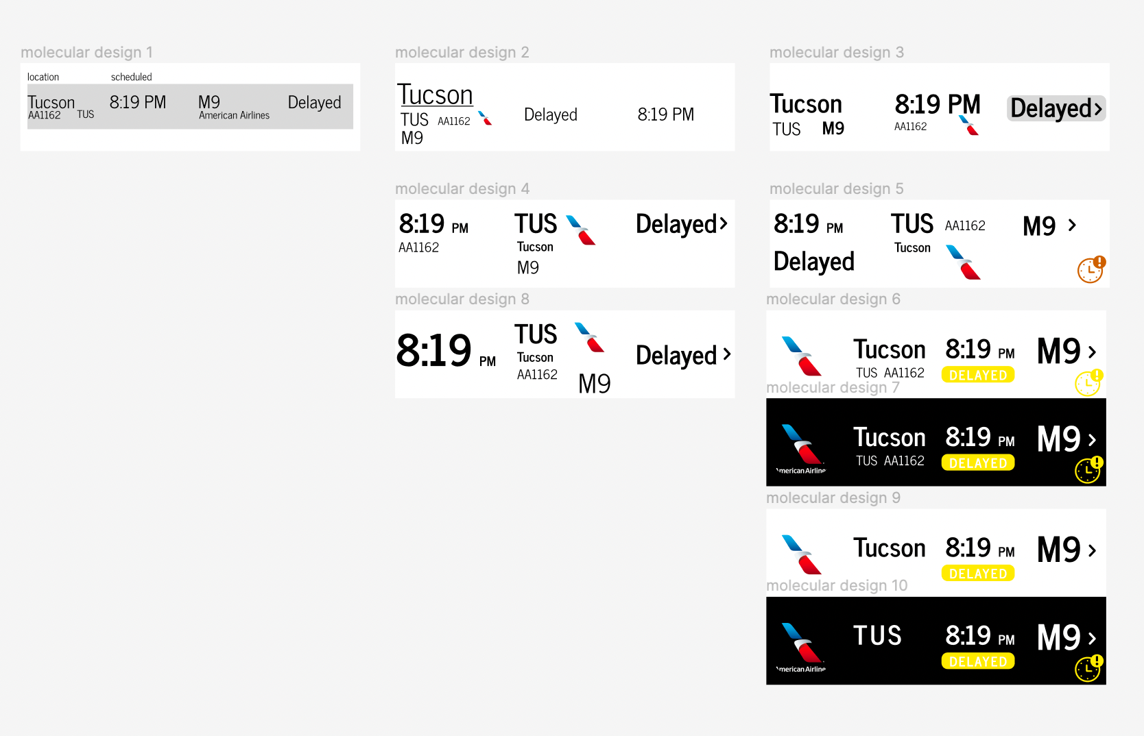
Along with sketching out the general look and layout of my app, I also started by designing the molecules of the flight information system. Doing this before designing the full screens for the arrivals and departures pages helped me plan out and envision the layout and overall organization of my app.
Screen Development
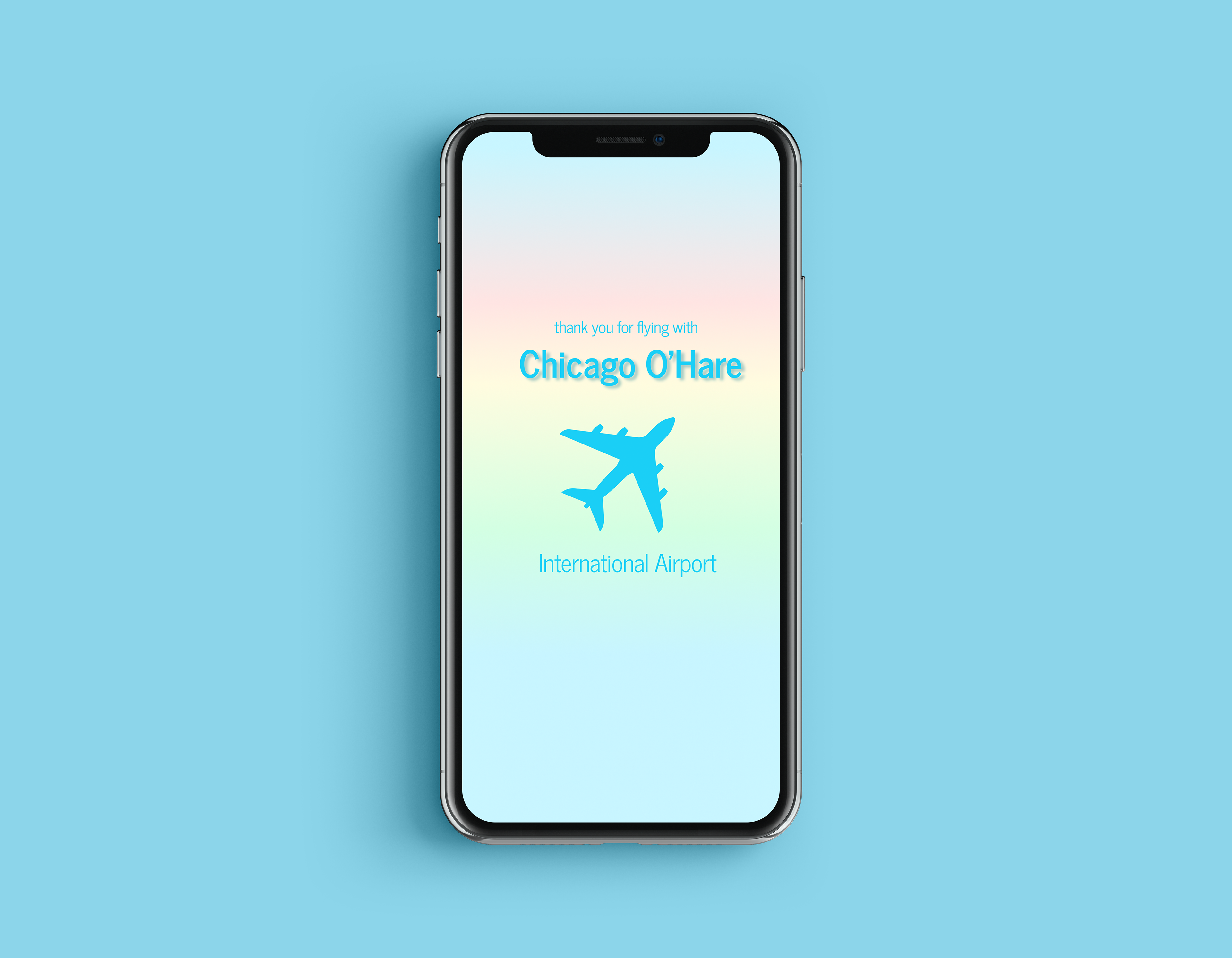
Loading Screen
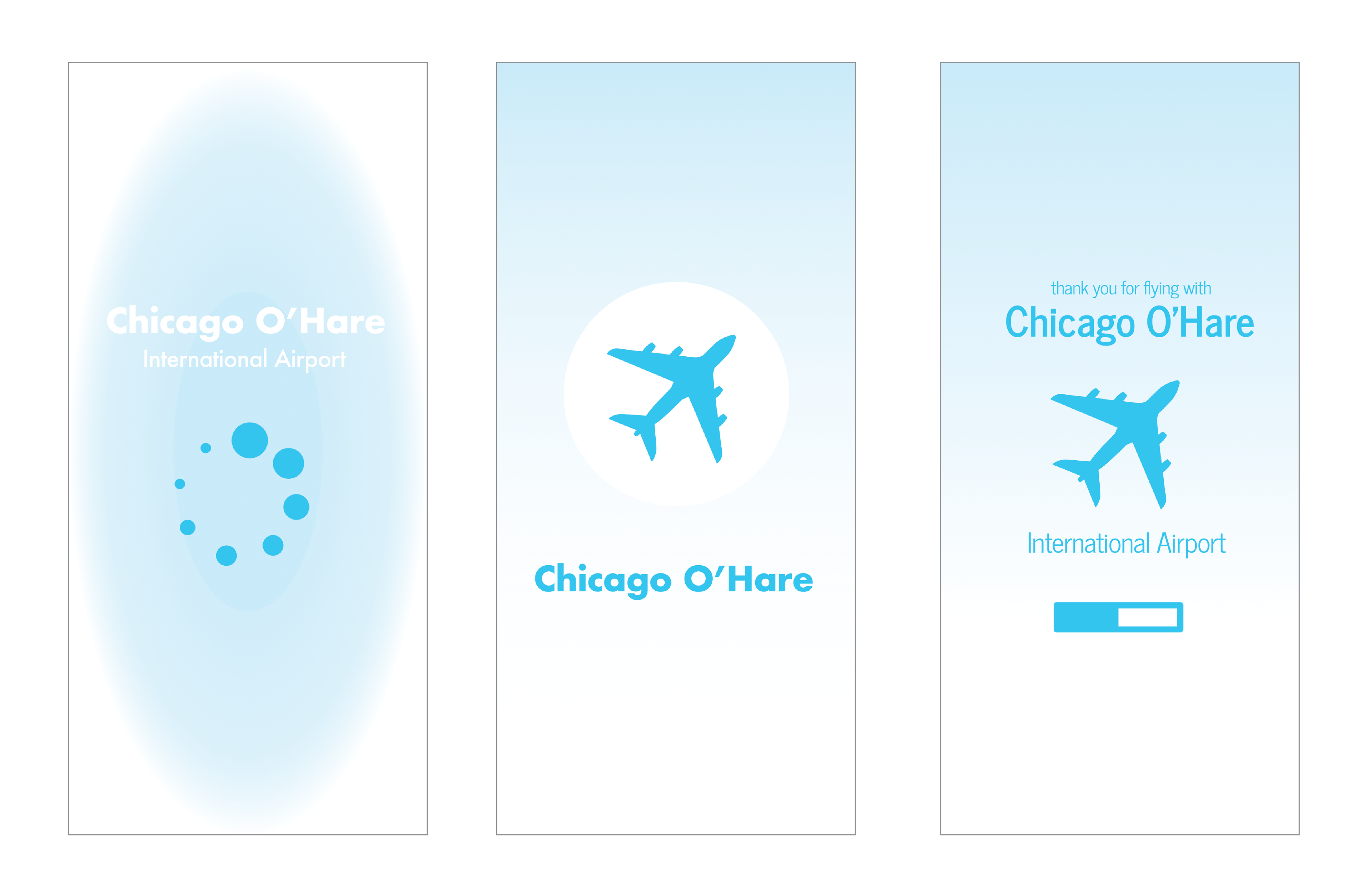
I wanted to create the loading screen in a way that makes it clear that it is not an airport app but specifically for the Chicago O'Hare airport. After I chose a final ideation I received feedback to add a little more color to the loading screen. I used the same colors from the text of the flight status to create a rainbow-like overlay as the background for this screen.
The final loading screen serves as a first impression to the user, so I aimed to portray the feeling of a going on safe and calm "flight" through the app.
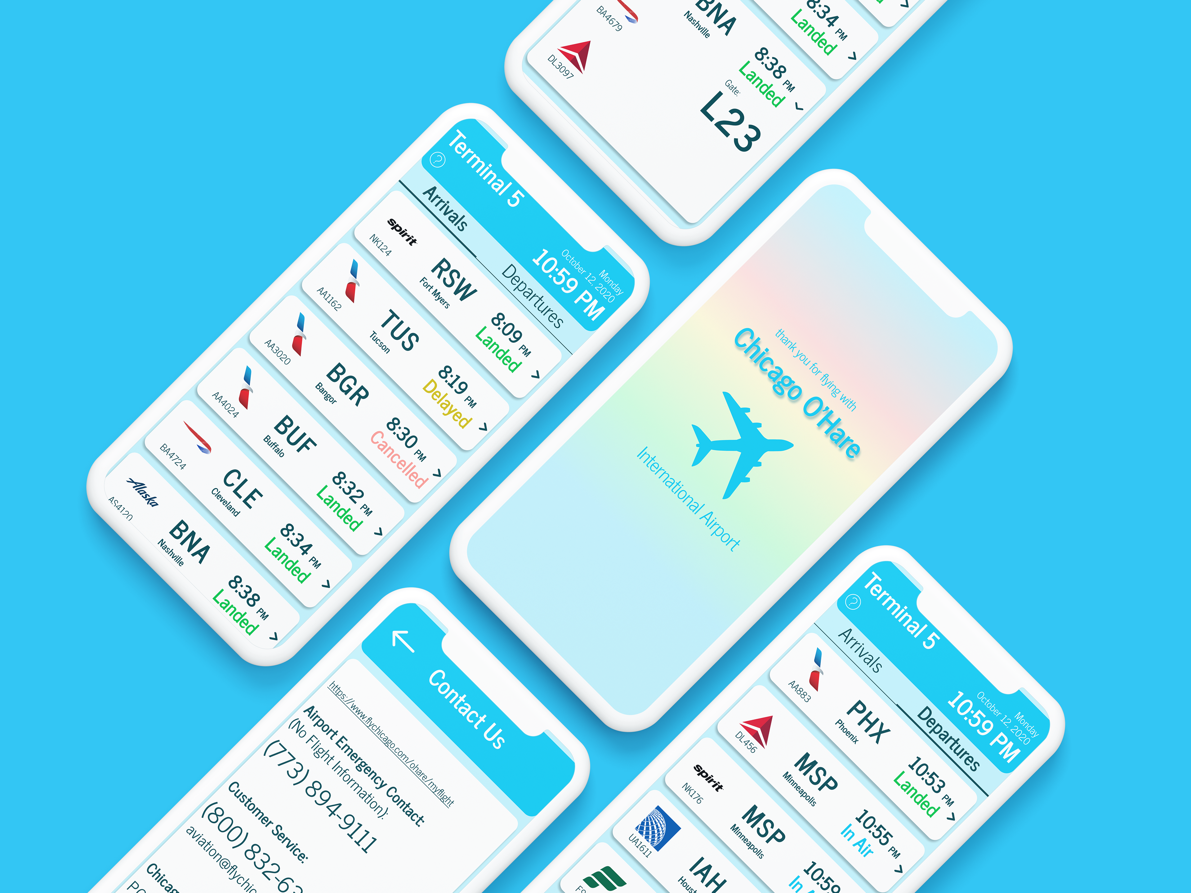
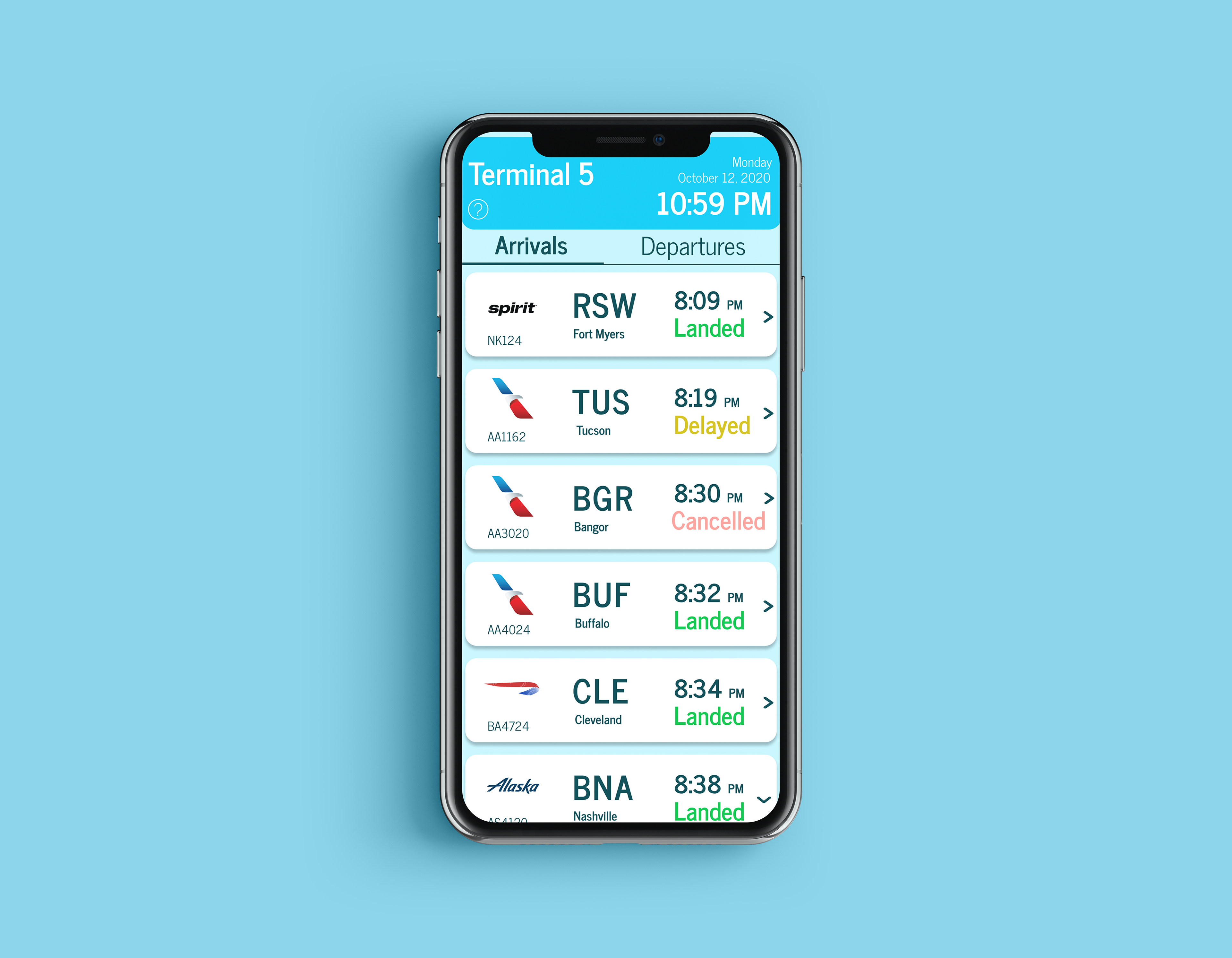
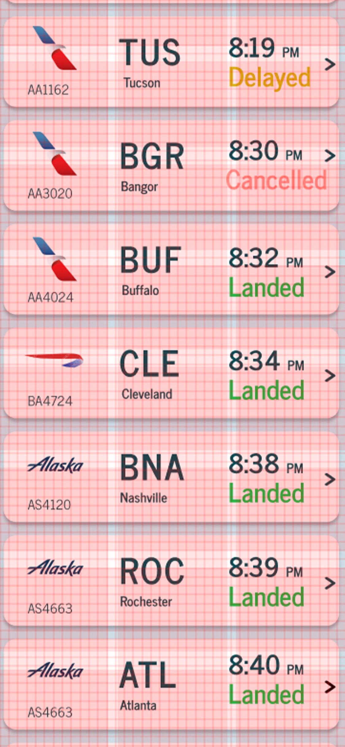
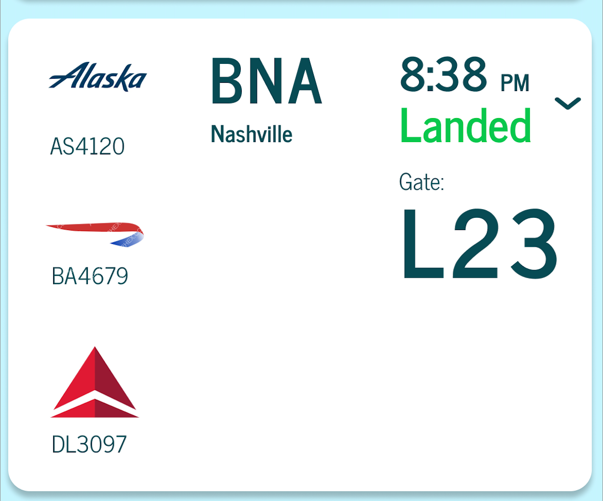
Arrivals & Departures Screen
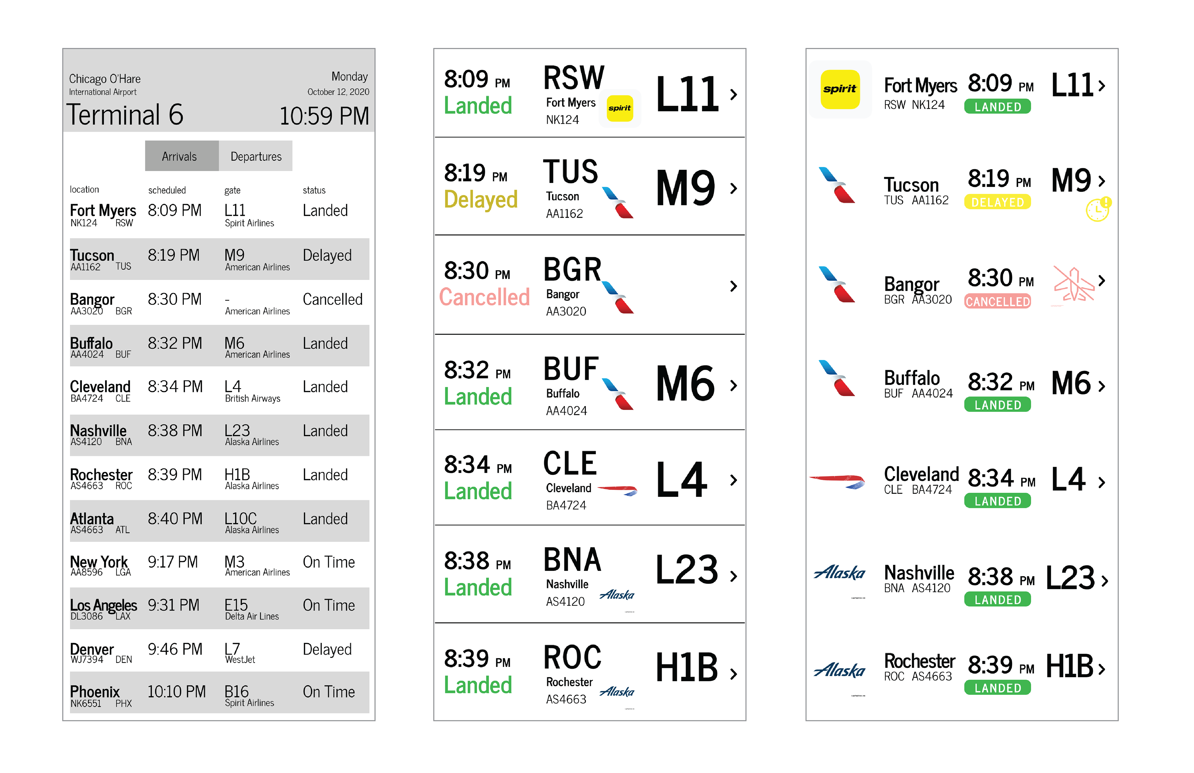
I experimented different ways of dividing the flight molecules in order to avoid overwhelming the viewer with too many elements and overuse of contrast. I utilized a typographic modular scale calculator website to ensure that the hierarchy of text sizes is clear and to optimize readability.
I combined the different aspects that I found to work the best from these ideations to my final screen iteration in addition to adding color to bring attention to the status of each flight.
Once I developed the layout and hierarchical system of the rows, I fine-tuned the design by creating a grid to ensure that the information looks visually balanced and organized.
Additional Flight Information
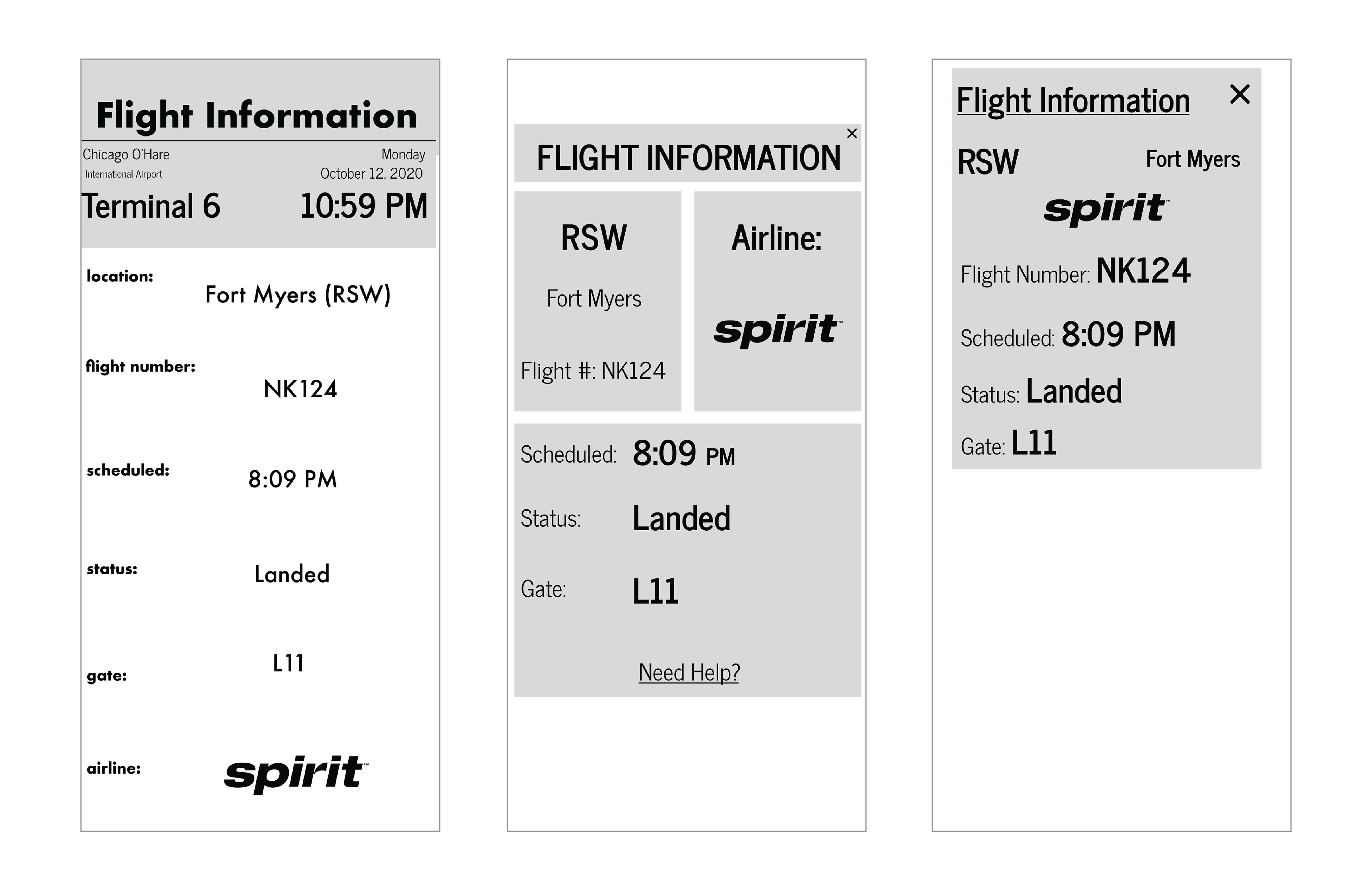
I first aimed to organize the addition flight information that could not fit into a single molecule onto another screen, but found that having the app user navigate from screen to screen just to see a few more pieces of information to be tedious.
I decided to incorporate the additional flight information such as the gate number and airline as part of a drop down menu for each of the flight modules. This way all the information about the flight is kept together.
Contact Screen
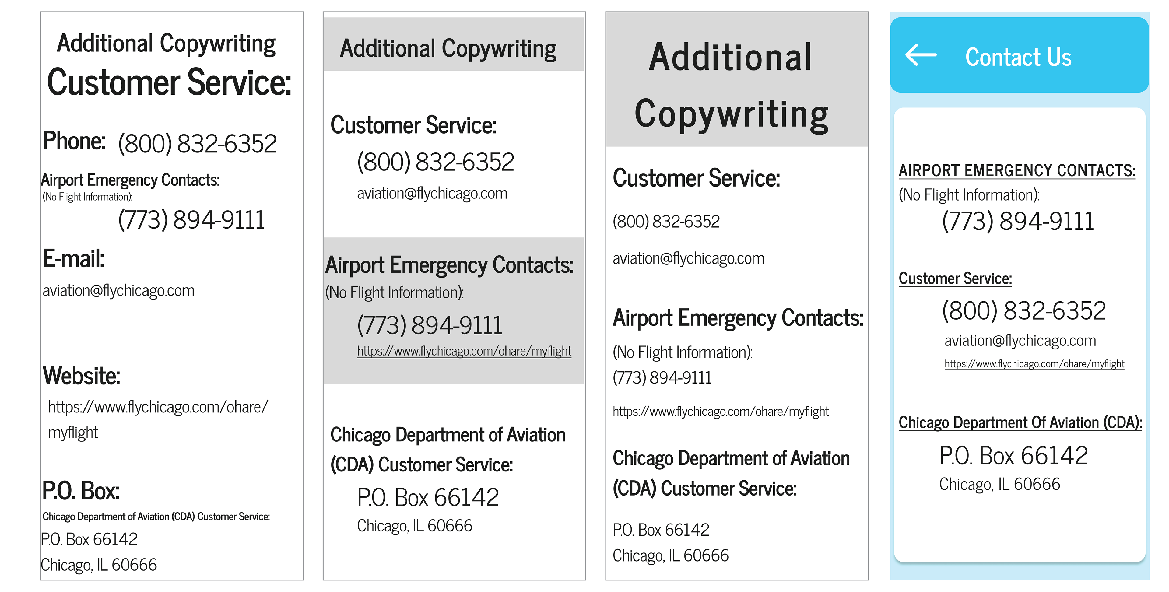
For the contact screen I wanted to make the division between the purpose for each phone number clear while still having its overall style match the previous loading and flight information screens.
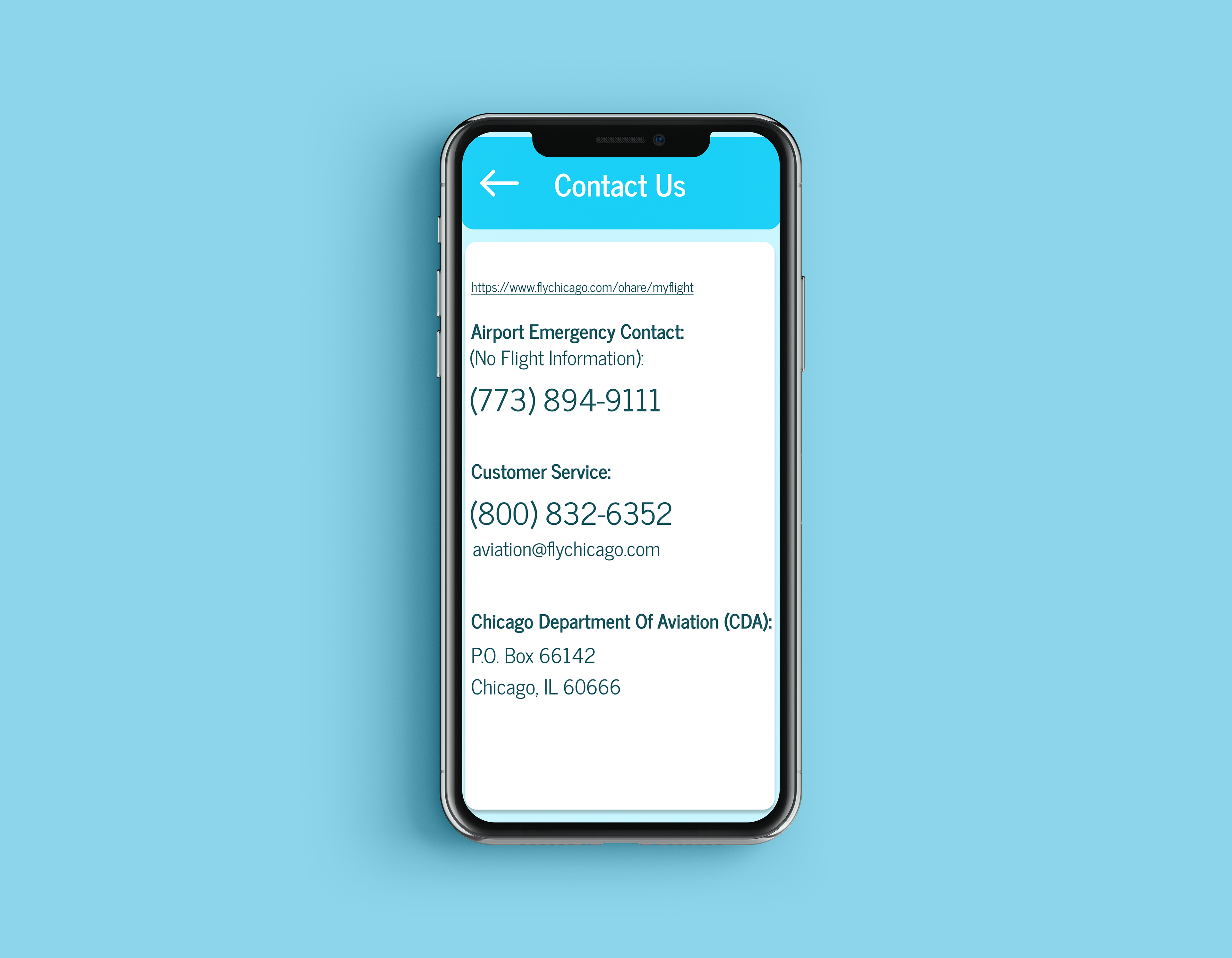
Final Prototype
I took aspects that functioned well from my early ideations such as the header and the organization of the molecules and applied them to my final screen iterations.
I then used Figma to develop an interactive prototype for the app I designed.